- Understanding the UX Principles That Work For Uber (and Can Work For Your Business too)
- 1. Focus on Localization
- 2. Shed the Belief that Customers are King
- 3. Give Attention to the Journey
- 4. Loved Businesses Make Empowered Customers
- 5. Promote Related Services Non-Intrusively
- 6. Uber UX design guidelines for on-demand apps: Treat Paying and Non-Paying Users Alike
- 7. Constant Feedback - an Integral Part of the Uber UX Strategy
- 8. Be Only a Few Clicks Away
- 9. Impose Accountability on All Your Stakeholders
- 10. Give Security its Fair Share of Focus
What separates Uber from the many other ride-sharing entities in the world is not the feature set.
Because the feature set that Uber entails is one that almost every other Uber clone app contains – Reason they are called Uber Clone.
No, what separates Uber from other similarly operative businesses is Experience.
An experience that the rider and driver share from the moment they take out their phone to book an Uber.
The result of this Uber app design trick that has come to be associated with the essence of how the brand operates is Brand Resonance. Something that you can experience today itself.
What you will have to do is get consciously active when it’s time to head home from work. That’s it.
See how people around you take their phone out to book a ride and no matter which platform they are on, the majority of them will say they are booking an Uber.
Isn’t this level of brand resonance something that every business aims for? Especially when they operate in a highly crowded mobile app domain?
What if I told you that the secret of how to redesign an app to get its brand resonance lies in the Uber app itself.
Well, it does.
And we will spend the next 8 Minutes in exploring exactly what Uber does in name of user experience that you too can follow to achieve every greatness that the ride-sharing mogul has. A complete disclaimer: Uber is not the only brand which gives serious design goals, Hulu app redesign also has been giving designing goals to businesses.
However, for the sake of this article, we will be concentrating on Uber app design principles.
The elements that we are going to delve into now are ones that can be integrated into your app, no matter what background your application belongs to.
Understanding the UX Principles That Work For Uber (and Can Work For Your Business too)
1. Focus on Localization
One of the main answers of how to redesign an app like Uber’s lies in Localization.
The UX designer team at Uber gives a special focus to ensure that no matter what geographical background location their drivers come from, the experience that they get is all same.
This way, the whole onboarding becomes a breeze and the app learnability curve gets down to an absolute low.
By learning how to do app localization, you too will be able to offer a uniform experience to your users, no matter where they are located. An additional thing to understand here that there is a difference in localization and globalization.
The simple formula is that you should provide for localization if your business caters to multiple ethnicities in the same country and globalization if your business extends to multiple nations.
Here are some things you should take care of:
- See that the app content can be changed to a different language
- Give the users the ability to message in their regional language
- Hire a team of customer support who are bi-lingual.
2. Shed the Belief that Customers are King
You will find millions of articles aimed at methods to drive mobile app engagement among your paying customers. All of them focusing on how important it is for businesses to keep their ultimate customers pleased.
But it is rare to find pieces on how to keep the other stakeholders – the service providers – happy.
Uber is one of those few companies that pay equal attention to the customers who make the final payment AND the drivers who give them a comfortable ride. Uber drivers, in general, are pretty happy with the way they are treated by the agency.
Everything from remuneration to leave policy is devised keeping drivers in mind.
For you to be a brand as appreciated as Uber it is important to give equal attention and benefits to all the stakeholders and not just the customers.
It is the only thing that would help you get a clear answer to how to increase mobile app engagement.
There are multiple ways to go about it
- Give your service provider the freedom to reject the service
- Make it easy for your backend stakeholders to connect with your team
- Make a separate profile for them and show them the ratings that they have received
3. Give Attention to the Journey
If you spent any elongated time in the Uber app, you would know that there is a lot to explore even during the ride.
You can watch the driver’s story video or order something from Uber Eats which is rightly advertised inside the application.
With elements like these, Uber proves that it is not just the interaction points that are important but during part as well.
No matter what your app idea is, until and unless it is something that requires users to be inside the application the whole time like in case of Netflix App, you will have to find ways to improve your app’s user experience after ux review to build that connection.
Some ways to work on your app engagement with the help of your mobile app UX design company can be –
- Add gamification in the application
- Give your users media to interact with – music, videos, etc.
4. Loved Businesses Make Empowered Customers
Gone is the time of Baby Boomers.
The present-day belongs to Millennials. And millennials don’t appreciate hand-holding.
Millennials want to feel empowered. And Uber understands this.
In fact, this understanding is what answers ‘How Uber Uses Psychological Tricks to engage more users’.
Uber gives multiple queries to the end users to choose from when they face an issue. And these queries do not involve them contacting the support till a much later time – something that holds the secret of how to make your app go viral.
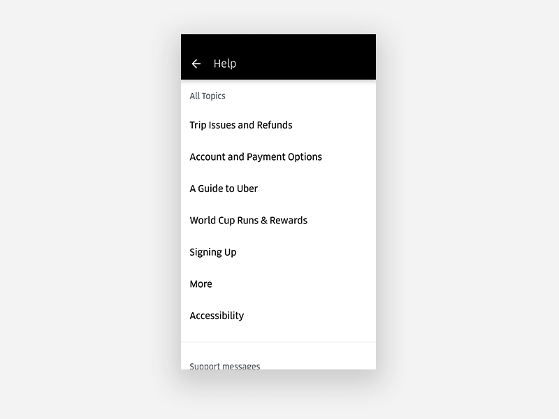
You can follow the route by:
- Having a detailed FAQ screen
- Giving answers to all things that are in customers’ hands to solve
- Placing your support email in a place that is easy to approach but not the first option
5. Promote Related Services Non-Intrusively
How to design app like Uber? Be non-intrusive
Uber does an amazing job with showing dishes that you can offer through UberEats on the main screens of the application.
While you cannot order from UberEats from inside the ride-sharing application, it does a great job of sending you to the play store to install their other app.
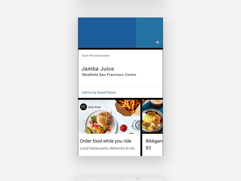
The placement which they have set for their other service is so articulate that you will only click on it when you need to but its presence won’t bother you still.
Now, it is not necessary that you should also have another service to follow this Uber app design pattern. You can even follow this principle even when you follow the Advertisement based monetization model.
And also if you offer a subscription to the users to get access to other features of your application.
A few ways to achieve an Uber level of non-intrusiveness *pun intended* are:
- Set an icon to show elements that are accessible through the premium account, without sending a pop-up to users mid-app interaction
- Have a reward section inside your hamburger menu list and mention that the way to get the reward is through viewing videos
- If yours is a gaming application, add the option of ‘view ads to’ or ‘install the app to’ feature after at least one successful round.
6. Uber UX design guidelines for on-demand apps: Treat Paying and Non-Paying Users Alike
A bit in continuation with our Customer is not King point, is the factoring of how you should treat your free and paid customers alike. A key to how to redesign an app like Uber’s
While there is no concept of free customers in case of Uber, the ride-sharing mogul does not discriminate between riders booking a Sedan or those taking the Pool ride.
The only difference that is between the rides is in terms of car type and money. And that’s just about it.
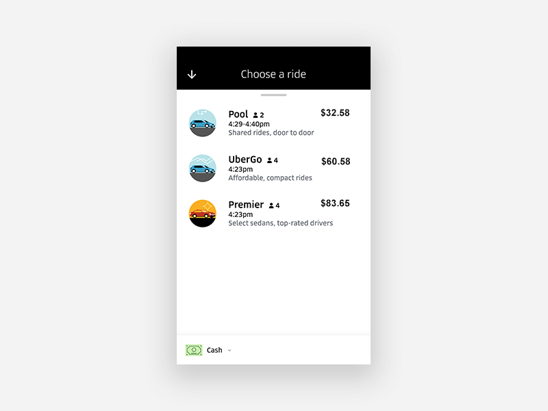
It is a given that the premium customers would get extra features, it might be something as simple as no-ads while viewing videos or something major as unlimited content access.
But what is uncool is keeping a big difference in terms of feature set and giving your free/less-paying customers MVP like features.
In the end, the feeling of true accomplishment should be the same between both classes of your users.
Here are a few ways you can achieve this –
- Make the premium set of features an upgrade of your present features and not a completely new set
- Be honest about what users would get if they choose to go Premium and let them decide
- Don’t ask them to join the premium class until they have used up all the free benefits
7. Constant Feedback – an Integral Part of the Uber UX Strategy
The whole of the Uber driver app redesign was based on feedback.
The brand’s team of UX designers didn’t take a single step without getting a consensus of all the drivers in their community. An act that defines the meaning of community.
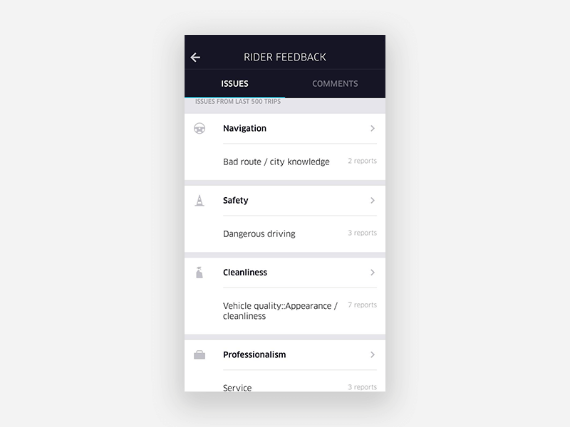
When you constantly ask for feedback and not for ratings, the attitude of your users change. Which then has a direct impact on your user retention rate.
Because, at the end of the day, users want to feel that they are a part of your business. A valued part.
Uber makes them feel this way by asking for constant feedback. You can make them feel this way by designing apps that drive user engagement and retention –
- Asking your app’s improvement area on the email they have shared
- Adding ‘Send Feedback’ option in the menu list
- Give them the option to leave feedback when they rate your app low
8. Be Only a Few Clicks Away
Being approachable is Uber’s forte.
The company has made it easy for the stakeholders to approach the customer care both on email and telephone.
Users only follow a few steps to reach out to the customer support team – it’s that easy.
As an app entrepreneur, you too should make it extremely easy for your users to get in touch with you.
All the customer touch points should be visibly present everywhere inside the application – inside the menu list, in the support section, in the settings page and so on. Basically, everywhere your customers might get stuck.
9. Impose Accountability on All Your Stakeholders
What makes Uber special is the fact that the brand breaks the social stigma.
There is a social stigma that drivers are seen as inferior beings and they should be treated as such. But Uber changes the mindset.
Uber enables the drivers to reject a ride if the user rating is low. Thus giving a reason for the riders to behave well with the drivers.
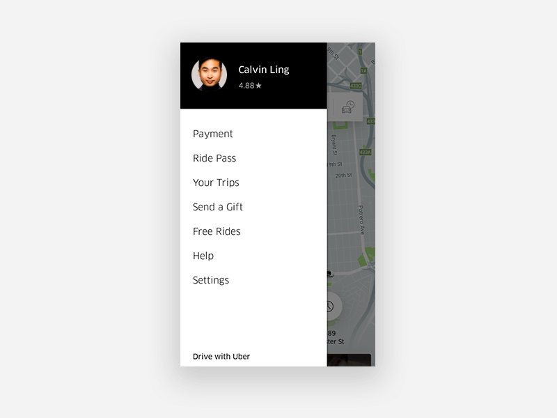
This level of accountability is what you should aim to introduce in your app. Give ways to your customers to connect with the service personnel with respect and integrity.
A few ways with which you can achieve this are –
- By sharing stories about the service people – telling customers their aspirations
- Prompting customers to tip them or say good things about them
- By making it known in the Disclaimer section that the attitude your customers will keep will have an impact on their ratings.
10. Give Security its Fair Share of Focus
Although it was a journey full of scandals for Uber to understand the importance of security, but the brand has come to know of its importance.
And it is not just in the backend. Security has found its place in a number of places inside the application. Uber even gives the option to the users to share their rides with people whom they know – thus seeping security deeper in their life.
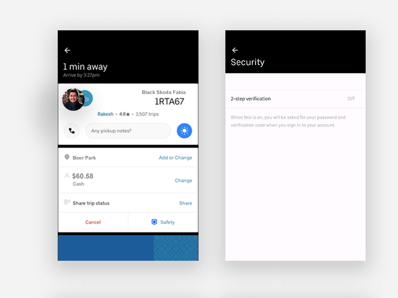
A few ways you can give the same secure feeling to the users include –
- A badge of security on the app home screen
- Multiple authentication options
So here were the ten Uber UX design principles that you should copy in your app, today.
Need help from Product design and development company? Fill the form below and our team of UI/UX experts will get in touch with you.


Excellence Together
11 Principles of UX Design From A Startup Perspective
When we hear the word design, we think of creativity or some creative role, in which an individual crafts and designs something beautiful. But, there is a thing with UX design that makes us understand that only aesthetically good designs won’t make for a usable interface. A good user designer makes great user research. When…

15 Steps to Mobile App Redesign for Market Domination
App redesign is no joke. If you run a mobile-powered business then you are virtually on life-support while indulging in a UI UX overhaul. And if you do not realize that already, then there is all the more need for someone to point you in the right direction. We assume you want a word by…
