- What is VUI (Voice User Interface)?
- Steps for designing voice user interface
- 1. Research your audience
- 2. Define
- 3. Create a prototype
- 4. Test your product
- 5. Refine
- Design guidelines for voice user interface
- Don’t wait for users to ask first
- Keep the list of action options short
- KISS - Keep it simple and short
- Let users know they are being heard
- Confirm when the task is done
- Challenges of designing VUI
- Privacy and Security
- Convey what Voice assistants can’t perform
- Difficulty in prototyping and testing
- Support of language
- Future of VUI
- Final Note
Ever since I saw the first part of Iron Man, I’ve been fascinated by the potential of AI technology Tony, all too well with his AI assistant Jarvis.
But hey! We are already halfway there in not reel but real life.
Remember using Siri for the first time on iPhone 4S? It was an otherworldly feeling, was it not? And since then, we all know how far we have come – Alexa, Google Assistant, Cortona and a hundred more.
So, as an inspired designer, if you are as fascinated as I am and want to give the voice-based AI a chance, then you need to hone your skills and knowledge on how to design voice user interfaces.
Luckily, you have stumbled upon the right article. Here is everything you would want and need to know about VUI and what makes them an important part of intuitive app search design.
What is VUI (Voice User Interface)?
Acronym of Voice user Interface, VUI is the interface that allows users to interact with a system through voice commands. The most popular and top voice user interface examples are Google Assistant, Siri, and Amazon’s Alexa.
The biggest advantage of VUIs is that they facilitate an eyes-free and hands-free way of interacting with a system.
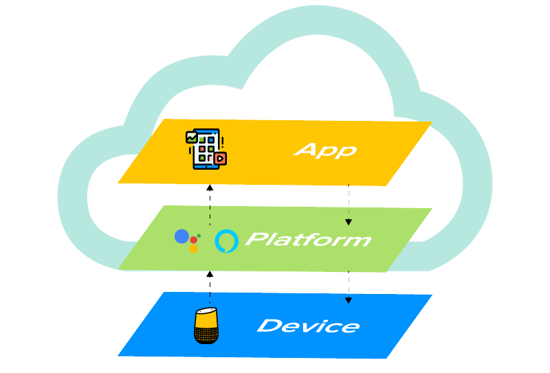
Similar to mobile apps running on any OS and a device, VUI contains three layers that need to work together for efficient voice interactions. Here, each of the three layers uses the layer that is below it while supporting the one above. It is the upper two layers in which the voice interface lies, residing in the cloud and not on the device.
Steps for designing voice user interface
1. Research your audience
In this process of designing VUI, you need to employ user-first design just as you would while designing other digital products. The primary aim here is to gather information and understand the behavior and needs of the users since this information is what makes the foundation of the product requirements.
What you should focus on at this stage is –
- Identify the pain points of users and how their experience is. By doing so, you will be able to analyze where the users can benefit.
- You must gather information on the user language- how they talk and the phrases they use while talking. This will help you design a system for different utterances.
2. Define
At this stage, you need to define the capabilities and shape the product. This includes –
- Creating key scenarios of interaction
These scenarios come before the specific ideas of the app and should be identified in order to be turned into conversational dialogue flow. They are a way to think about why someone would need to use a VUI. So, you need to design the scenarios having high value for your users.
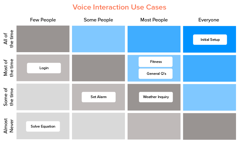
Sometimes, it can be confusing as to which scenarios are important and which can be ignored. For this purpose, you can use a use case matrix to evaluate each one of them.
- Make sure these scenarios work with voice
What matters the most here is that the users are able to solve a specific problem more efficiently than they would be able to with the alternatives. The aim of this step is to find the common and specific cases which users will benefit from.
Among many, a few cases are – A. when users are pre-occupied and cannot use the visual user interface, and B. when they want to do something quickly. I.e, commanding the VUI to “Play some music” is much less time consuming than to do it manually.
- The three factors- Intent, Utterance, Slot
Let’s understand these two with the above-mentioned example of “Play some music”.
Intent – It basically depicts the broader objective of the voice command. There are two types of intents – A. High utility ( very specific and straightforward command, i.e., ‘turn on the lights in the living room) and B. Low utility (vaguer and hard to decipher). In our case, it is a high utility interaction.
Utterance – It deals with the possible ways users can phrase a request. In our case, the alternative to “Play some music” could be anything from “I want to hear some music” to “can you play a song” and so on. All the UI/UX designers of VUI have to take the variations into consideration.
Slots – When the intent is not sufficient, slots come into action. They refer to the additional information needed in order to deliver the best results for the query. They can be optional and required. In our example, the slot is ‘relaxing’ but it is optional since the category of music is not defined by the user. However, if the command was ‘book a taxi on Uber’ the slot would be ‘destination’ hence, required.
3. Create a prototype
The dialogue flow is the answer to the question of “how to create voice interaction between user and technology”. The process begins with creating a dialogue flow for each requirement you are aiming to target with your product.
These are the following points a dialogue flow should cover – Main keywords for the interaction, probable branches where the conversation could head towards, and example dialogues for users and assistants.
A dialogue flow in our case is nothing but a prototype illustrating the back and forth conversations between users and voice assistants. Let’s look at an illustrated dialogue flow below for better understanding.

You can use several prototyping tools at your disposal for VUI. Some of the most popular ones are Amazon Alexa Skill Builder, Sayspring, and Google’s SDK.
Writing dialogues
A compiled set of dialogues is what makes the building blocks of voice user flow. Here are a few tips for creating engaging and conversational dialogue –
- Don’t make the process tediously long. Keep the number of steps to a minimum.
- You should not teach commands to the users. This is something that is natural. Instead, focus on making your voice assistant conversational.
- Try to keep your questions and responses brief. Here are the dos and don’ts.
Don’t –
User: “Tell me a good place to eat Chinese cuisine”
System: “I have found five places for you. The first one is “Eat Chinese” is located…, 15 minutes away from you, open from 8:00 AM till 8:00 PM, the second is “Chopsticks” which is located on…, 1 hour away from you,…”
Do –
User: “Tell me a good place to eat Chinese cuisine”
System: “There are several Chinese restaurants in the area — would you prefer to walk or drive?”
Identify errors
Isn’t it better to identify the probable errors you can make while creating dialogues than to fix the magnified mess later? Here are a few things you should definitely stay away from but always keep them in perspective to avoid error states.
- Ambiguity – Words are inherently ambiguous. Meaning, if a person says ‘Good’ it could mean ‘Okay’ or symbolize they are listening. So, make your AI aware of all the commonly occurring ambiguities for optimum performance.
- Misspellings/Mispronounce – Unlike on paper, words are spoken differently. One single word could have multiple pronunciations, something which could hamper the conversation flow between the user and the natural language processing system.
- Not providing relevant options – Always make sure that the users are getting something valuable and relevant out of the conversation. Irrelevant results for a query are least attractive and even less of a motivating factor for users to use your product again.
Even if the query does not have a positive result, your assistant should always reply and not leave the users hanging. That is, if a user requests “Book a flight to LA from Dallas for Tuesday”, what should follow is – “I couldn’t find any flights for Tuesday”. And what even better is – “I couldn’t find any flights for Tuesday. Would you like me to check for Wednesday?”.
Portray your brand’s identity
Even in human conversations, the tone of the voice matters a lot since it has an emotional value attached to it. Then, your dialogues are what is going to become the personality of your product and it should always make a positive impression in users’ minds. You need to create not ‘just dialogues’ but the ones satisfying users’ emotional needs.
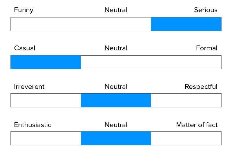
Use existing content
If you use the data at your disposal (all the conversations your product has with the user), you can greatly personalize their experience. For instance, if a user commands “I want to order noodles”, your system should revert “ Would you like to repeat your last order of Hakka noodles from Chopstick?”
4. Test your product
After everything has reached a near completion stage, it is time to test the seeds of your labor. You need to test the VUI you have designed to make sure it fulfills every benchmark on your checklist. There are two ways that you can use to test your prototype.
- With target users
You can create groups of your targeted audience and then implement testing sessions to observe how users are interacting with your product. You can use this occasion for tracking task completion rate and customer satisfaction score (CSAT).
- With test simulators
Similar to other simulators used in mobile app development, Google and Amazon also provide tools for testing the designed product. You can test the Alexa Skill and Google Action of the product with respect to the hardware devices and their settings.
5. Refine
After your app has landed in the market, it is time for observation. It’s time to indulge in UX analytics. This stage deals with analyzing how the users are using your product. It can be a lot challenging if you are clueless about what metrics you are supposed to observe. So, here are the most prominent ones.
- Sessions per user or messages per session
- Languages used
- Intents and utterances
- User engagement metrics
- Behavior flows
Design guidelines for voice user interface
“Words are the source of misunderstandings” – Antoine de Saint-Exupéry
Normally, visual user interfaces also have issues that need to be addressed, but the frustration from a faulty visual interface is nothing compared to that of a VUI. So, if your designed voice assistant fails to function well, it would be ditched like a hot potato.
(You may also like to read our article on Visual Storytelling for App UI/UX Design)
You know what will help you in stopping that from happening? – VUI design guidelines. So, let’s have a look at them at once.
Don’t wait for users to ask first
Unlike a visual user interface, users might not be able to get familiar with the functionalities right away. They might not even know how to start. In that case, one of the Voice UI best practices is to take the first step. For instance, if yours is a voice-enabled weather mobile app, it could say to the users – “You can ask for today’s weather or a weekly forecast.” Additionally, you should also offer an easy exit option.
Keep the list of action options short

Until and unless you want to overwhelm your user right in the beginning, you need to make sure that you provide only the most appropriate and basic options primarily.
The verbal content has to be as concise and full of meaning as possible while being easy to be understood in one go. As recommended by Amazon for designing Voice user interfaces for mobile apps for Alexa, one must not list more than three options for interaction. Doing this will also ensure an engaging UX design of the VUI.
KISS – Keep it simple and short
This principle is highly useful in designing VUIs. To make your voice app development the best out there, you need to make it easy for your voice assistant to understand commands. Suppose, you are designing a voice interaction to start a shop floor machine, the simplest way would be to attribute these multiple machines with numbers and then give commands like “Start machine 1”, etc.
Let users know they are being heard
Remember how agitated you feel when there is no activity sign on a webpage you just opened. Now, multiply this frustration in the case of VUI.
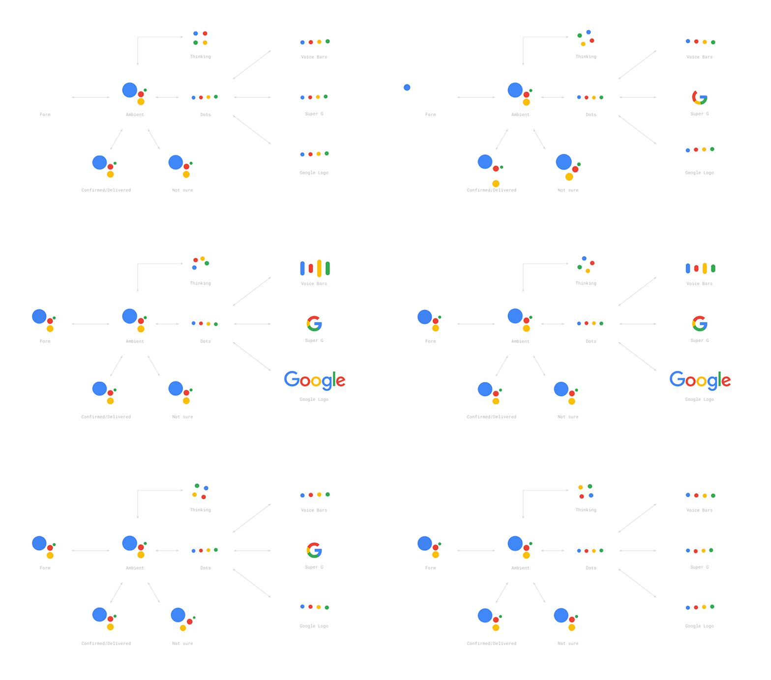
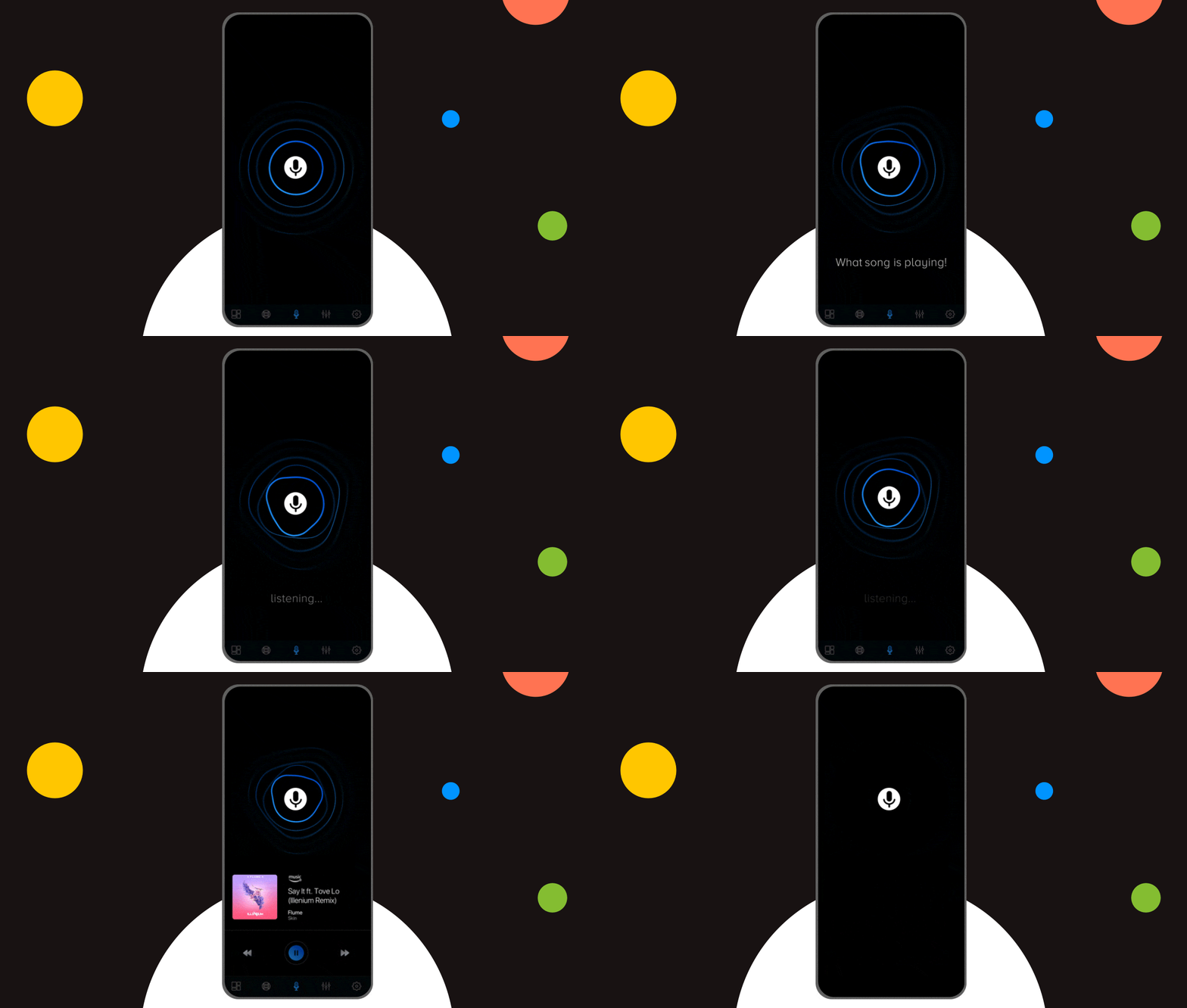
It is very crucial to keep it in perspective that your user needs to be informed when the device is actively interacting. You must give users queues on when to speak and when the voice assistant is listening. An image above of Google Assistant shows how it represents this function (with dots forming a wave) and with Alexa as shown below (bluish light swirling around the top rim of the device).
Confirm when the task is done
Just like you need confirmation after you have made any transaction, the same thing is needed with a VUI. Else, how would the user know the task has been performed?

For example, once the user gives the command “switch off the kitchen lights”, your assistant must respond with something like “Kitchen lights turned off”. This will eliminate the need for the user to check the task done in person, which is essentially the whole point of having a Voice-based AI.
(Bonus Read: Mobile App UI Design Tips & Trends to Follow in 2020 {Exclusive})
Challenges of designing VUI
Like everything else, the voice-based interface also suffers from Achilles’ heel. In fact, there is not one but many. So, what are the challenges that VUI designers often come across and more often than not, fail to recognize or resolve?
Privacy and Security
The fact that these voice-based AI assistants are always waiting for queues listening to the sounds of their environment poses a big concern for the users. The paranoia of their privacy being tampered on is not irrational either.
Initially, voice assistants like Alexa stored all the conversations they came across which is a big risk of voice AI in the eyes of users. Something of a nightmare happened to a couple when Alexa was caught sending their secret recordings to a stranger. Now, some assistants automatically delete the stored conversations every 24 hours or so. However, these come at additional cost and UI friction.
Convey what Voice assistants can’t perform
It becomes challenging for voice UI and UX designers to explain to the end-users what the Voice AI cannot do. For example, while using Google Assistant when you say “Make an event named Sales team meeting for Tuesday at 2 o’clock” it creates an event card instantly and asks later “Would you like to save this event?”
But what if you need to change the location or time of the meeting later, what then? It would reply “I’m not sure about what you said, would you like me to save this event?”. To avoid the bad user experience, the AI could simply say “sorry, I am still working on adding locations”.
Difficulty in prototyping and testing
Another challenge faced by the designers is voice UI prototyping and testing. Suppose, you have created a prototype and want to test it. You have given the initial prompt that users can shop groceries with your voice assistant.
The challenge begins here – Users can say a particular thing in different styles, something which is hard to keep track of. It becomes all the more difficult to test the prototype on such queries when it is not yet fully developed with the voice search technology.
Support of language
Since the main tenet of voice technology is language, it becomes crucial for any voice-based AI to be fluent in understanding as well as speaking. Sadly, technology has only developed with respect to a few languages as of yet. Nevertheless, adding other languages and distinct accents to the interface is still a work in progress.
Future of VUI
Like a ritual, we are bound to look at the future prospects of every technology and voice is no different. From what we have gathered from the voice interface use cases such as Alexa, we know that voice technology integration alone cannot fulfill the daily requirements of the users.
The best way for it to become completely adopted is by shaking hands with the visual user interface – just like Google Assistant and Siri. VUI and visual user interface together can balance out each others’ shortcomings providing users with an amazing voice assistant experience. Additionally, this will allow them to do complex tasks with simple voice commands, which is what voice interfaces lack at this point in their development.
And who knows by the time this decade ends, we might all have our Jarvis and would be able to do it all like Tony Stark without a physical display.
Final Note
VUIs are here to stay and will be integrated in more and more products in the future. We hope that our blog was helpful in clearing all your doubts regarding designing of voice user interfaces. But, in case you still have any queries or want to learn more about VUI, you can connect with our team and our experts will gladly help you with innovative solutions.


Excellence Together

Intuitive Search Specs that Separate the Best from the Rest
Sometimes you hear people utter the phrase “I had an intuition” at which point you may wonder whether he/she has the ability to view the future. But that isn’t the case. Intuition is the feeling people derive based on instinct and this instinct isn’t based on conscious reasoning. This subliminal, cerebral concept holds immense significance…
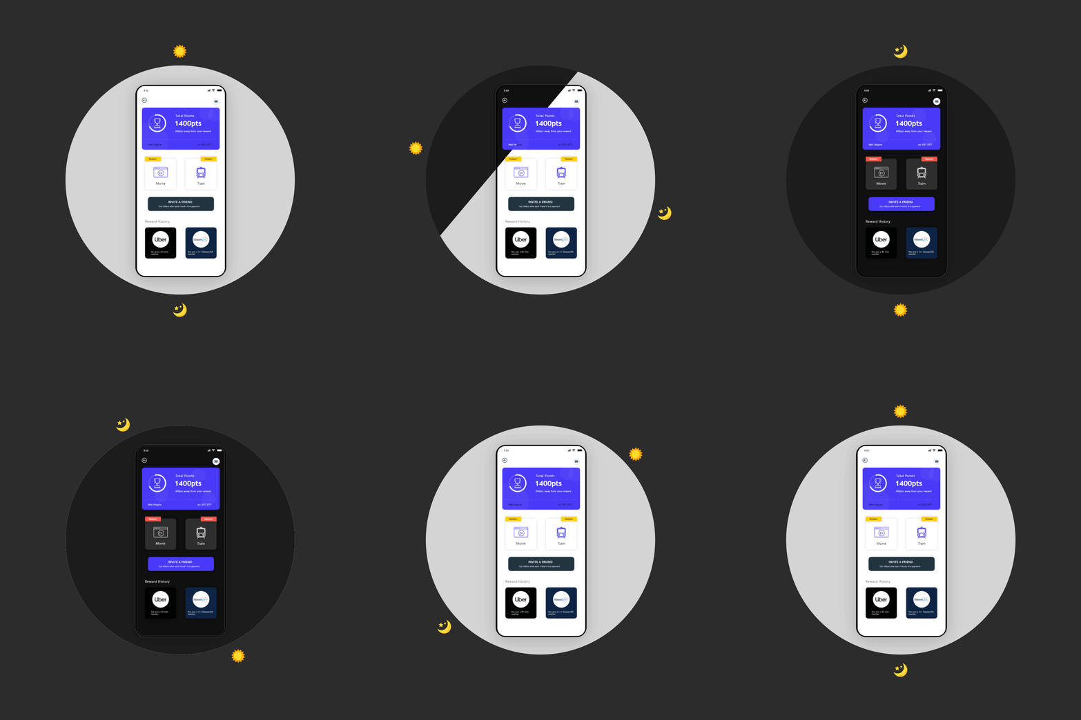
How to Design Dark Mode: A 2024 Guide for Mobile App Designers
Dim the lights, relax your eyes and save your energy. Dark mode is one of the biggest trends in mobile app design, and world-class brands like WhatsApp, Instagram, Google, Facebook and Apple have already jumped on the dark mode design train. The official launch of Android 10 and iOS 13 brought Dark theme User Interface…
